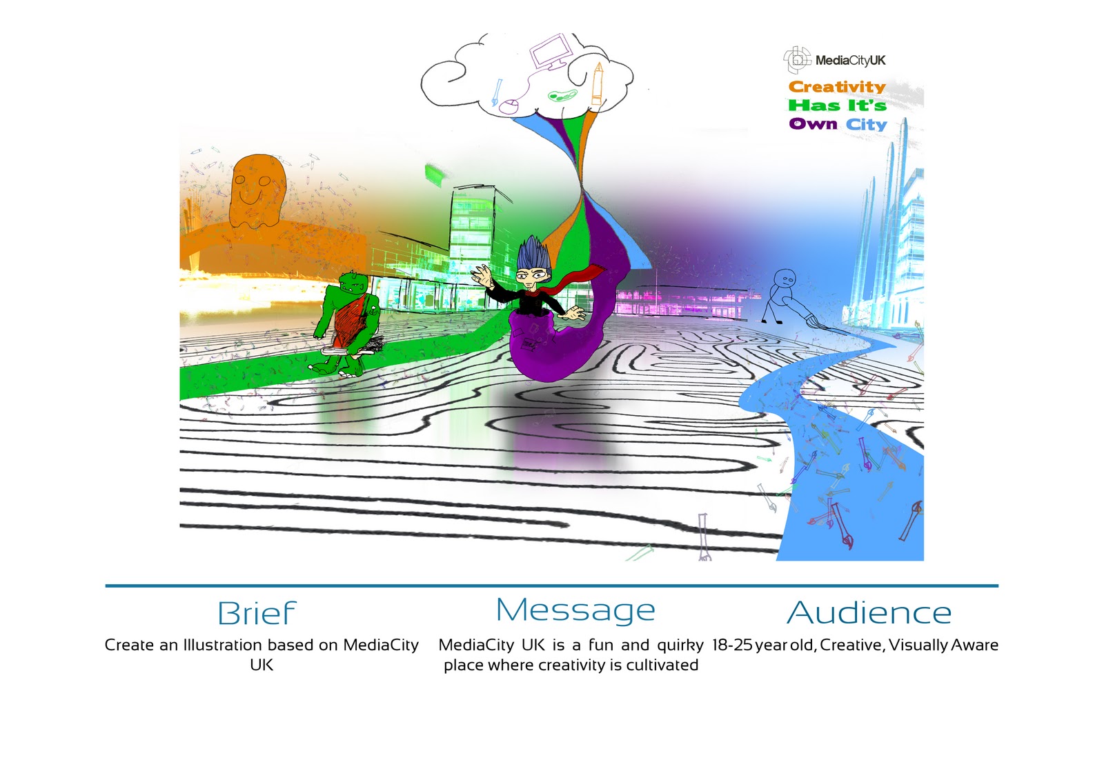
Well, this is it. I am almost missing it already, i've had a lot of fun these past 10 weeks getting really stuck in to designing my own personal logo, an illustration for MediaCityUK and of course, the two DPS and advertisement.
I want to continue using this blog as a platform for my future creative work, i've become really involved in this whole blogging business.
I feel like I could have done a bit better in places, mainly time management. A few times I would leave a lot until 1-2 days before. Just makes me wonder what my work might be like if I had instead spent more time on this but to be fair, I did have a lot of Uni work to juggle. Ah well, you live and learn.
Final submission tomorow. Looking forward to the feedback tbh :)
Wednesday 8 December 2010


Monday 6 December 2010
Online Magazine
My tutor, Lizz Shaw, has edited and published my articles and advertisement along with every one else who resubmitted their final DPS/AD to Issuu. Thanks Lizz :)
http://issuu.com/artdessalford/docs/the-
http://issuu.com/artdessalford/docs/the-
Wednesday 1 December 2010
Sunday 28 November 2010
Recent Inspiration


Updated Double Page Spreads


Typefaces on Parks DPS
Removed hyphens
Corrected spelling mistakes
Modified pixelated circle on Design Agency in Manchester DPS
Update the copy so it is all my own words.
Saturday 27 November 2010
Feedback For DPS/Advert 2
So...I apparently have the internet despite being under the impression it was off this weekend. So, i'll do a post on the feedback I got on Thursday.
Copy
Some mistakes, different font would work better DPS1
Some mistakes, different font would work better DPS 2
Hard to read type Advert
Images
Looks fine no problem DPS 1
Great but pixelated circle Design Agency DPS
Fix logo on Advert
Referencing
All references given on blog
Grids
Title on left side sits alone DPS Parks
Good DPS Design Agency
Eye Catching Advert
Editorial Flow Team
Left hand side needs thickening (more text?), background needs diming a little, better font to compliment article DPS Parks
Clever and well thought out DPS Design Agency
Good Advert
Typography
Type too playful DPS Parks
Text under tile is not right size or space
Based off of the feedback, I have a pretty good idea what needs to be tidied up and modified.
Friday 26 November 2010
Flickr and DeviantArt Links
I am now on flickr and have uploaded my illustration and the photos I took.
http://www.flickr.com/photos/ashleywakefield/
And here is my deviantart. Bare in mind, some of this work is college level and where I have used brushes and stock imagery, I might not have referenced it properly. And some of it is pretty shabby, ha.
http://mustash2003.deviantart.com/
I will soon get a twitter and/or a linkedin. Seeing as I live in the halls of residence and the internet is down this weekend, I won't be able to do another update until Monday at the earliest. So, until then, goodbye for now.
Wednesday 24 November 2010
Update DPS 2


Not content, I did the background AGAIN. As you can see, it was a rather peculiar process because I wanted one thing then, changed the idea about half way through. I think this suit my DPS more anyway.
DPS 2/Manchester Parks Update


Update Ad

Feedback for DPS/Advert
Advert:
-Modify to one picture but the layout is good
or
-Make the images more vintage looking.
DPS1/Design Agency
-Think about angular stuff
-Good background and heading
-Imported pictures don't really work
-Main text to big
-More Info
-Good structure, nice font
-Background image overpowers the whole document, maybe blend in
DPS2/Manchester Parks
-Very Good Layout
-Too green, Overpowering Background
-Really Nice Background Image
-The text to the right gets a bit lost
-Best design so far
-Type sorta blurs into the background
-Blurred Images
-Right Page layout doesn't compliment the left page
-Good Concept, Nice use of colour
So, from all that it's very across the board in regards to what I have to modify so I will consider the opinions presented here and progress where necessary. I think i'll progress as follows
Advert-
Modify some of the images to give a more vintage look
DPS1/Design Agency -
Work on not having the background overpower the text
Experiment with font for title
DPS2/Parks
-Text to right needs work
-Tone down background
Many of the complaints were because of blurred images which is funny because the actual uploads on this blog aren't. Anyway, better get to it.
Wednesday 17 November 2010
Advert

http://www.manchesterfashion.com/images/mfn-mainlogo.png
http://www.manchesterfashion.com/uploads/galleries/standard/4cb55cca328bf.jpg
http://www.manchesterfashion.com/uploads/galleries/standard/4c12449b635ac.jpg


Double Page Spreads


Much of this is place holder. The text isn't mine although i've made some alterations. The images aren't mine either outside of the backgrounds (my own work). Before final submission, I aim to make as much of this as possible my own work.
I've already detailed the sources in pervious blogpost but I may as well do it here again
http://www.studionorth.co.uk/
http://blog.studionorth.co.uk/wp-content/uploads/2010/10/ericwright1.jpg
http://blog.studionorth.co.uk/wp-content/uploads/2010/09/unirider_21.jpg
http://blog.studionorth.co.uk/wp-content/uploads/2010/08/RU-Sure-RGB-300x300.jpg
http://blog.studionorth.co.uk/wp-content/uploads/2010/08/Background.jpg
http://www.manchester.gov.uk/info/200073/parks_and_open_spaces
http://www.manchester.gov.uk/info/500194/irk_river_valley_project/4753/irk_valley/1
http://www.manchester.gov.uk/info/670/parks_and_open_spaces-outdoor_facilities/2844/walking_in_manchester
http://www.manchester.gov.uk/info/461/parks_and_open_spaces-information_and_advice/2008/parks_for_all_seasons-a_parks_strategy_for_manchester
http://www.manchester.gov.uk/images/treedecorationsnthcityfestival.jpg
http://www.manchester.gov.uk/images/Windsurfing190.jpg
http://www.manchester.gov.uk/images/cmsbigweekend.jpg
http://www.manchester.gov.uk/images/irkvalleyv2190.jpg
DPS Progress (screenshots)


Subscribe to:
Posts (Atom)