Sunday 31 October 2010
Wednesday 27 October 2010
Illustration Stategy
I want my illustration to reflect the message/values of MediaCity UK whilst also being visually interesting for the exposure I might get from this. The audience is visually aware anyway so it will have to be unique enough so that my audience can recognise it as my own work as well as the intended communication about MediaCity. Cutting Edge, Modern, Digital I think are 3 key words I should consider for this design.
MediaCity UK Report by Natasha Carter
Natasha Carter talks about Media City UK. Natasha is a media trainee on the Media Foundation Placement Scheme and currently working at ITV.
MediaCity UK
MediaCity UK is a location where creative and digital companies, students, residents and visitors will be. The Peel Group is behind the project, they are a infrastructure, transport and real estate investment company. Peel has ports ports in Liverpool, Manchester and Glasgow; and Liverpool John Lennon Airport; Durham Tees Valley Airport; and Robin Hood Airport Doncaster Sheffield.
MediaCity itself is striving to be a community with ties to Salford Univeristy, the BBC and Vision+Media.
http://www.peel.co.uk/
http://www.mediacityuk.co.uk/index.htm
Illustration Style- Vector Drawing
Vector Illustrations are drawn on computers and can vary in their execution. Some are very technical and complex, others are simpler and clean edge.
Illustration Style-Mixed Media
Mixed Media illustrations use a range of different materials both digital and traditional. These include pencil drawings, paints, crayons, inks, charcoal, photographs, 3D and vector drawings.
Not made it to Mediacity Uk yet
I will aim to get the photos in the morning before my tutorial but if I can't, i'll make sure it's up this weekend.
Tuesday 26 October 2010
Illustration Primary and Secondary Audiences
My illustration will be aimed at my own age group primarily. 18-30 year olds are more visually aware and respond better to good design and creative visuals. I want my illustration to be visually appealing and interesting to creative businesses as well, such as media groups and design agencies, something they might enjoy to look at.
Illustration Based on MediaCity UK Statement
I want to create an illustration that ties into the modern feel of the Salford Quays area, the new/exciting developments that are taking place. I want my illustration to communicate the place is a hotbed of creativity that is funneled into design/media. I think the illustration I design will be mixed media in styling.
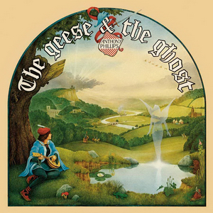
Peter Cross
Peter Cross is a UK illustrator who specialise in book illustrations. He was a technical illustrator before he became freelance.
http://www.anthonyphillips.co.uk/associates/pc.htm
http://www.anthonyphillips.co.uk/associates/pc.htm
Tony McSweeney
Tony McSweeney is a UK illustrator who I found in the book Best of British Illustration and Photography. His illustration style is traditional and has been used for book covers.
http://www.meiklejohn.co.uk/artist.asp?artist=102
http://www.meiklejohn.co.uk/artist.asp?artist=102
Illustration Research
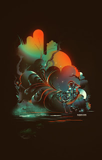
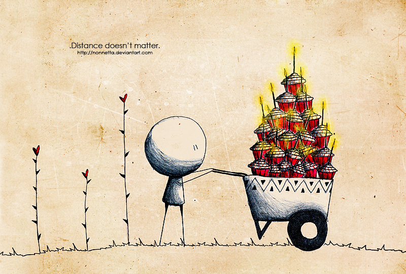
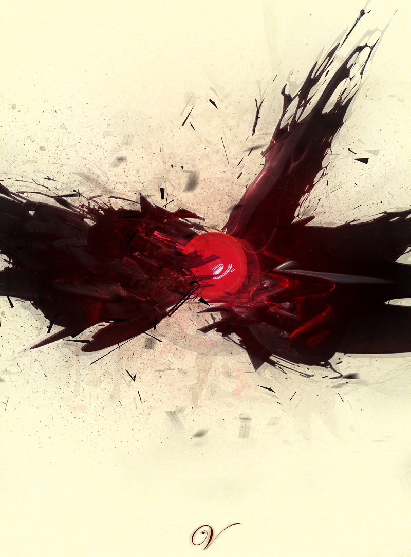
Varying Styles by various contemporary illustrators.
http://graphicstreetracer.deviantart.com/
http://wolfen-graphix.deviantart.com/
http://system-s.deviantart.com/gallery/
http://www.folioart.co.uk/illustration/folio/artwork/three-of-diamonds/
http://graphicstreetracer.deviantart.com/
http://wolfen-graphix.deviantart.com/
http://system-s.deviantart.com/gallery/
http://www.folioart.co.uk/illustration/folio/artwork/three-of-diamonds/
Wednesday 20 October 2010
Tuesday 19 October 2010
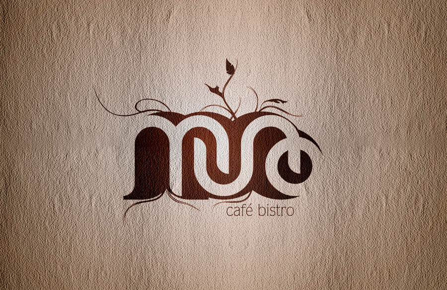
You know when you see a piece of design and you just have to show someone?
This logo is seriously awesome.
http://cihanyildiz.deviantart.com/art/Muno-Cafe-Bistro-Logo-107347498?q=special%3Add&qo=0
http://cihanyildiz.deviantart.com/art/Muno-Cafe-Bistro-Logo-107347498?q=special%3Add&qo=0
Thursday 14 October 2010
Logo Modifications
Here i've made a few alterations to my logo based off of the feedback. This includes increased weight of the my initials and putting in lines to distinguish the intials. I think it isn't necessary but, i'd like to hear/read what you think. Put this in version in blue....whilst I get feedback on what colour(s) to use.
Logo Colour Modifications
The feedback I got today suggested I change the colours of the logo. Notice i've ommited the type whilst I decide what to do with it. Feedback please :). I want to know whether i'm taking this in the right direction.
Graphic Speed Dating
With a title like that, I hope you aren't expecting something naughty because I would have to disappoint you. No, this morning I was tasked with giving feedback on fellow coursemate logos and to get some for my own. I had to go around the room and sit across from someone and evaluate their logo and communicate the intention(s) behind my own. After seeing everyone, the same thing kept popping up over and over again. The graphic itself was strong enough without the type. Now, I didn't orignally have the type but I considered Stacey's feedback http://www.staceystringfellow.blogspot.com/ and added it to the design. I can appreciate what everyone thinks though and I too think my logo would work without the type.
Another thing that came up was the weight of the initials that I worked into the logo. Whilst the design itself is strong, the initials are overwhelmed by the lightning bolt. I will of course work on this. One last thing, to move away from the "Adobe"-esque look of my logo, I will consider different colour versions, Yellow, Blue, Purple, two colour mainly.
I really enjoyed the feedback I recieved today.
Wednesday 13 October 2010
Cool Brands
Alexander McQueen
I like the typeface used in this logo and the arrangement of the type. "McQueen" is the emphasis of the type, probably because the name is very important and recogniseable. The logo gives off a sense of class and sophistication and is very clean edge.
BBC iPlayer
This logo is very nicely designed. The play button has been worked into the letter "I" and this informs people it is a media service. The use of pink/purple colouring is usually associated as perhaps feminine but comes across as lively,elegant and energetic.
BlackBerry
This logo is well designed. The icon to the left is recogniseable because it is an unusual combination of shapes to make it look like a blackberry. The type itself is nice too and compliments the styling of the graphic.
Subscribe to:
Posts (Atom)


